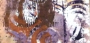
In this exercise I moved away from the recent colour scheme (greens / reds) slightly by selecting small sections of a decorated paper I had from a recent workshop on printing with wax resists and watercolours. The original paper was hence quite pale in colour and led me to extend the sections into more subtly coloured designs than before.
I selected 3 small sections (10cmx4cm). The markings were in ochre, green and dark purple but that hasn't really come out in the small photos:
I placed each within an A4 page and extended the designs off the edge.
 |
| 9.1 |
 |
| 9.3 |
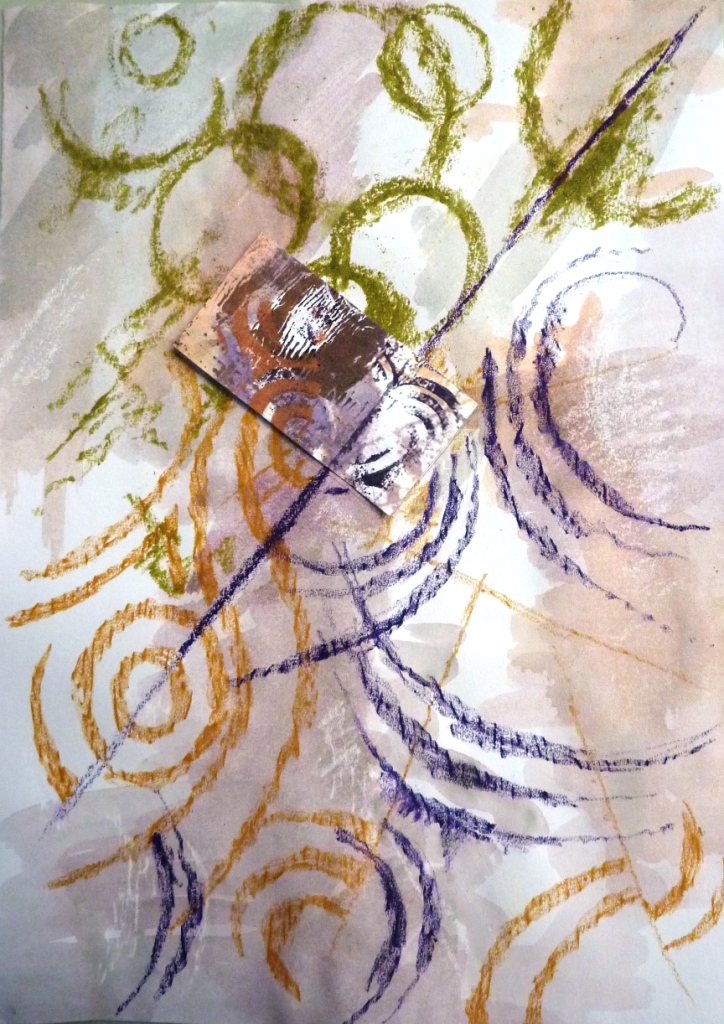
The three designs were each drawn in Markal paintsticks and water resistant oil pastels with watercolour washes on top. The original sections had markings in olive green, ochre and purple so I kept with these colours.
I then took 2 of them (9.1 and 9.2) and placed them on A2 pages to extend the designs further:
 |
| 9.4 (A2 page) |
The A4 page of 9.1 was placed in the top left hand corner and extended to give 9.4. I placed more small sections cut from the original decorated paper into 9.4 to add smaller detail on other areas of the A2 paper.
 |
| 9.5 (A2 page) |
9.2 was placed in the centre of an A2 page to produce 9.5, along with more small sections (middle and bottom) as in 9.4
I then looked at specific areas of interest in these pages, areas that contained part/all of the original section.
 |
| 9.6 |
 |
| 9.7 |
 |
| 9.8 |
 |
| 9.9 |
 |
| 9.10 |
I first played around with the proportions of 9.6 as the curved lines appealed to me and suggested braids or cords.
 |
| 9.11 |
There was an interesting line of movement throughout the design that I could see developed as part of a larger hanging work. I created a tesselated form of the design using repeated and mirror images:
 |
| 9.12 |
9.12 I thought that this would make a great fabric design, particularly an edging where laced cords might represent the curved rubbings.
 |
| 9.13 |
With folds this could be a folded book, or with hinges on a large scale a folding screen.
 |
| 9.14 |
This vessel reminded me of Jean Draper and Ken Jones'
collaborative piece in PSG exhibition that Sian suggested looking at, particularly with some lacing cords around the walls of the vessel.
 |
| 9.10 |
I decided to go back to another closeup sample, this time photo 9.10 with a circle pattern. The enlarged sample was stretched horizontally and split into 3 suggesting a tryptic as below.
 |
| 9.15 |
The black background is A2 to give an idea of scale.
 |
| 9.16 |
This is the photo stretched vertically and split into 3 vertically. This could be one piece (approx 1m long) or designs for 3 separate cushions.
 |
| 9.17 |
This last idea for a lampshade comes from the original section stretched horizontally and squashed vertically. 3 copies of this have been suspended above each other with circles joining them (here represented with paper cut-outs). The colourings of these designs lend themselves to illumination I feel given the right fabric choice.


3 comments:
Fresh and wonderful! I love these!
These are so exciting and the colour is so different from the previous.
Lovel exciting designs, and the colour scheme is excellent, unusual and fresh.
Thanks so much for commenting on my PAP, it's been a bit of a journey, but I think it's coming together now.
Post a Comment