Pages

Monday, December 30, 2013

Module 5, Chapter 1: Lace research

After much deliberation I chose to look at the very early needlelace designs: Reticella and Punto in Aria as I knew very little of their development.  I am originally from an area of Scotland where Ayrshire lace and other associated whitework embroidery on sheer muslin was more familiar, and I had consequently studied this in the past.  I decided to take the opportunity of module 5 to look into something relatively unknown.

1.1 Supporting information to display boards
1.2
1.3
Also in an earlier life I had spent some years making bobbin lace and these designs reminded me of the geometric nature of torchon lace.  I guess I also enjoyed the precision of bobbin lace so I had a go at sampling a reticella lace insertion design (1.3).  I had thought that bobbin lace took an age to complete but that was nothing compared to this!

1.4
I followed the instructions I found here, and prepared a 2 inch square framework on 32 count linen using cotton perle 12.  Even on this scale, the double running stitches and satin stitches to bind the perimeter tested my patience and eyesight under a magnifying glass, so I don't know how lacemakers could do this repeatedly on a 1 inch square!
The reticella lace was then worked over this framework using buttonhole stitch, woven bars with picots and cast bride threads to create the pattern.

1.5 sample of reticella insertion square
This type of lace was obviously time consuming to make and a fashion feature generally for the nobility and wealthy families of Europe.

1.6
The rigidity of reticella lace made it particularly suitable for the proud nature of collars and excessive ruffs often seen in the Elizabethan era.
Punto in Aria lace developed as lace designs moved away from the geometric constraints of the warp and weft threads remaining in the ground fabric, and lace was formed "in the air" without a ground fabric at all. This enabled edgings to be more curved and intricate and whole lace to incorporate motifs of flowers, scrolls, birds using needlelace stitches without cutwork.  Again I found a similarlity to Bedfordshire bobbin lace, particularly the floral designs with many picots.

1.7

Tuesday, December 17, 2013

Clearing the decks

Gave myself an early Christmas present this week - a clean floor around my workspace - finally organising and presenting my last Module's work in folder format.  It also included finishing the paperwork outstanding for Module 4 and preparing a design board (two A3 sheets) for my PAP3 piece.


Timing involved in PAP3:

Research and design work for this piece started in February 2013 and was completed end April 2013 (covering approximately 35 hours)
Sampling and embroidery work started March 2013 and completed end August 2013 (covering 85 hours)

Costing involved in this PAP:

Fabrics
3m silk organza
150g merino wool roving
1m white merino prefelt
4ply wool for cording
80
approx 50g landscape dye
5
approx 3 reels sewing thread
10
watersoluble stabiliser for lacework
8
vinegar as mordant for acid dyeing
2
Total $105 AU

Self Evaluation of PAP3:

I enjoyed researching and developing this piece.  It referenced the faces/portrait design work of module 3, the motif design development of module 4 and the felt making skills develped in module 4, while having connection through the motif origin with my personal research theme overall - floral, vegetation.
It allowed me to explore my liking for lace in a felted environment and the result was well received when exhibited and gave pause for thought.

The design process again showed me the benefit of stepping back and rethinking a composition, creating more of the unexpected rather than the somewhat duller expected view.  The motif work in this case, demonstrated its use in creating a cohesive exhibition of pieces, a technique I'm sure I will reuse in the future.

Saturday, October 12, 2013

Collagraphs - part 2

Thursday saw me back at Primrose Park for the second day of the Collagraph workshop run by Primrose PaperArts.  In a previous post I had blogged about how we were guided by Chris Hutch to create our collagraph plates.  On Thursday we got the chance to try intaglio printing with them.
Chris, in the interim, had shellacked our plates expertly. (I found the full benefit of this later as I rubbed my plates excessively to in the inking up stage and not one bit of the "texture creating debris" I had stuck on the plate came off, wonderful).

My plates sealed with layers of shellac
In the beginning we had a go at embossing paper with one of our small plates without ink. I forgot to photograph my sample, probably because it didn't exactly appeal to me - the relief on my plate was probably too low and indistinct.  Chris demonstrated with a plate featuring a bolder motif from an old lace tablecloth and the resulting embossing was clearer.

On to the inking, firstly choosing only black on one of our small plates. My first effort was too dark having left too much ink on the plate; the second too pale due I suspect to the paper drying out too quickly (it was that 37 degree day if you remember in Sydney).  But gradually I got the idea vaguely and some useful prints were produced.
Despite the heat we were all enthused and very busy.
Jan inking her plate

Lydia providing inking tips

Kate excercising her muscles at the wheel

My most successful prints were done using a black or indigo ink as intaglio colour, then a second sable or ochre rolling onto the high relief areas of the plate before printing.


Even after all this messing about the plates themselves were great in their own right-


I had a great time and found that it's definitely a technique I would try again in the future. Thanks again, Chris. I could just see myself stitching into these prints.
 However I also discovered the mess that is ink and now understand the angst my purist printmaker daughter goes through in keeping her work ultra clean and accurately registered.  I don't know think I'll be following her to that extreme, my nerves couldn't take it!


Wednesday, September 18, 2013

"Transience" - my personal assessment piece 3 .....finally

After my tutorial session with Sian at summer school, way back in July, I considered her comments on my hanging and had some more work to do.  Her comments included possibly creating vertical tucks in the facial areas to reduce the flatness, achieving texture within the felted shapes, making shapes appear to 'fade away' at the bottom, and making some shapes appear to lift or curl off the surface.

In the end I went with some suggestions and not others.

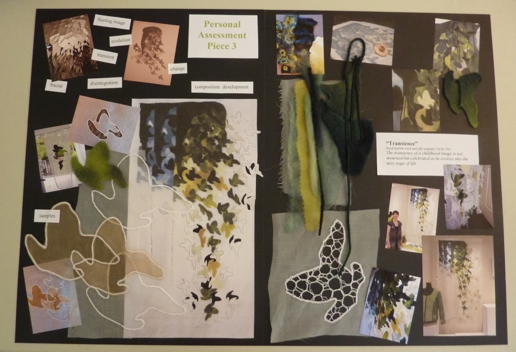
  • I created another sample to look at creating tucks in the felt but this made the organza below the tucks splay out somewhat like a skirt - I lost the 'drop' of the curtain hanging which I had liked.  So instead, I created the texture with thick cords couched onto the large dark felt areas.

12.15

12.16
This served to add texture further solidity to the hanging area while breaking up the dark felt area with surface interest.

  • I added further felted shapes to the top right area, stitching tucks and folds in them, while leaving them partially loose at edges.  Hanging cords continued the vertical lines of stitching throughout the hanging.
12.17

12.18
Further organza shapes were partially stitched, letting them lift off the piece, and stitched from thin cords to let them fall freely.

12.19

Finally lacy versions of the shape were applied to the bottom right edge to suggest fading and transformation.
12.20

12.21 Hanging seen from reverse through open doorway
I was fortunate to have an opportunity to exhibit this piece as a guest artist in "Exquisite Touch", an exhibition of the latest work from 5 artists working in textiles, beadwork, flameworked glass, and traditional lace at Craft NSW, Sydney.
I'm pleased to say that I met my deadline to complete this and it took its place in the lovely display yesterday on opening night.
12.22
Please excuse my hovering bag in the foreground - didn't realise it was in the shot until after the event.

The supporting statement read
"Transience
dyed merino wool, dyed silk organza, 1m x 2m

“Change is the only evidence of life”        E Waugh

Images are often captured memories of a subject which is constantly changing and evolving with the passage of time. 
In Transience I have played with merino wool and silk organza; with opacity and translucency, to express the evolution of one image into another.  The transience of a childhood reflection is not mourned but celebrated as the next stage of life is entered.

I had planned for the piece for window display but display constraints determined it looked better here, slightly offset from the wall which did created lovely shadows of the shapes behind.

The exhibition runs now until 29 Sept and for those that cannot get to see it, I shall have more photos up on my designs facebook page in due course.


Sunday, September 15, 2013

Collagraphs

I've been chained to my sewing machine so much recently, preparing pieces for an exhibition, Exquisite Touch at Craft NSW Gallery in Sydney that it was great to take a break on Saturday and do something completely different.  The exhibition incidentally opens on Tuesday 17 Sept 6-8pm, but more on that in the next post.

Back to Saturday - I went to a great workshop on making collagraphs, held by Primrose PaperArts in Sydney. This was the first of 2 days: the first day would be spent preparing the plates, the second printing with them.  I have a couple of books on the subject which detail the process involved and give design ideas, but nothing beats being tutored in person by an expert.  We were taught by Chris Hutch, a member of the group and an obviously experienced printer of beautiful collagraphs, who was so generous in her supplies and tuition.
Her own collagraph plates were artworks in themselves, let alone her prints.

This one features various fibres, gesso and glue
Various areas of the mountboard has been cut back to give darker areas once printed, and features surface texture with glue, mediums and carbundum
After seeing all this wonderful inspiration we made a start on creating our own, starting with mountboard like Chris. The following are my attempts of simple boards trying to use the demonstrated techniques.  I went with the more organic designs, looking to my A5 sketchbook from Module 1 dip work for ideas.  I had studied bottle trees quite closely at the time in various forms so I traced one of my drawings onto the board, and cut back a little to create relief.


A5 boards
 The board (above left) then had additional threads, kozo fibre, carbundum and crushed egg shell all set in PVA.  The one on the right has similar fibres and sandpaper strips set in manipulated gesso to build up a surface.
 This A5 board above has scrim and muslin in the background with pressed leaves and moulded leaf impressions.
This last board above was about A4 size and featured the bottle tree again in a little more elaborate cut back form with strips of mesh and embossed handmade paper (from certificate module, yes I keep everything).

That all took most of the day, so Chris so kindly took them home with her to dry properly and then seal them all with shellac for us so that they would be ready to print with next time - can't wait. But i'll have to, until 10 October. I'm more used to monoprinting of course, which is immediate in its results, so the time and thought involved in developing collagraphs is totally different.  My boards didn't really look like much for now, but I'm hopefully they'll turn out ok and it will be fun playing with them in a few weeks - watch this space.

Friday, August 9, 2013

"Lace Book"

While I was in the UK in July, I was lucky enough to attend a workshop at Art Van Go in Knebworth.  Not that I needed any excuse to visit the shop but a good thing I only had 2 days to peruse the supplies and fill my suitcase.
The workshop was with Julia Triston from Durham and proved to be a great 2 days working on creating a lace inspired sketchbook.  Her own bulging sketchbook was inspiration enough but she packed numerous demos and ideas into our time together to keep us more than busy.
We worked on sketchbook pages - staining, cutting, tearing, sticking, sewing - while they were removed from the book, hence the photos featuring separated pages in a pile.  It wasn't until the end of day 2 that pages were reconfigured into the ring binding and I realised how much everyone had achieved - a fantastic array of inspiration.  I took many photos but without others' permission have only included those of my own below.


Tuesday, June 25, 2013

Final paperwork for Module 4

Below I have commented on the storage and associated health & safety issues for materials new to my diploma work so far eg. use of wool and silk dyes.
I have self evaluated on work completed in this module omitting my PAP3 development, evaluation and costings etc of which will follow in due course.

Landscape (TM) dyes:
Powdered dye material used for dyeing wool, mohair, silk, alpaca (protein fibres) and nylon.  These are stored in sealed opaque containers out of reach of children and away from food sources and food preparation areas.
On current available information Landscape dyes have low oral toxicity, but it is advised that users avoid dust inhalation, ingestion, eye and skin contact by wearing gloves, apron and a mask when dealing with such dye powders.  Use utensils reserved for such use and not used for food preparation.

Materials to aid digital printing on fabric:
InkAID semi-gloss precoat:
Ensure that gloves are worn and there is adequate ventilation in the room of use. Keep out of reach of children.

Evaluation of work in Module 4
My focus of research into trees and vegetation for diploma made it easier to find close links to this module's floral based work.  My initial research in chapter 1 deliberately focused on new images to expand my sources already in my sketchbook, however I used images from Module 1 and sketchbook as backgrounds to link with new slips in chapter 6.
My design ideas for PAP3 employ newly developed motifs in Module 4 with designs and composition techniques developed in previous modules.  In this way I feel my work is progressing and benefitting from the course.
My artists study is closely related to the subject of this module and 2 of these artists have had a direct influence on my work during this time.

Authentication

with samples made for chapters 5 and 6 of Module 4.


Contemporary Textile artists - chapter 13

To complete the work for this Module 4 I have been studying textile artists with a propensity for working in felting, creating sculptural forms and using Kantha stitching in their work.

I make no apologies for selecting Australian artists here as I tend to have more opportunity to study their work at first hand, and interview one or other at a later stage for further research in Module 6.


Sunday, June 23, 2013

PAP3 developments

Moving on from my samples of motifs on organza and rethought design in previous postings I sketched a working paper design in the colours I wanted to use.

12.7 design
The paper design has additional shapes to the felt motifs which will be in dyed organza then outlined motifs in colour and in white - a sort of progression into translucency, bearing in mind that I wish to hang this freely in a window space.  The very white sections on the drawing represent cut areas in the organza.

So here is the laying out of the design in prefelted shapes.  Because of the size (about 3m x 1.5m) I did this on the floor then struggled with getting it to the felting table in one piece.  Note to self: get a bigger table.

12.8 laying out felting design
The felting in process a section at a time:

12.9 nunofelting process
and the nunofelted organza before stitching anything:
12.10 Nunofelted hanging on organza
I have now worked into this organza adding the dyed organza motifs, embroidered shapes and cutwork.

12.11
You'll have to excuse the red curtains above but I wanted to photograph in an open window and the open patio doorway on a rather wet wintry afternoon had to suffice.  You'll see more detail in the next photos:

12.12

12.13
The top and side edges have been simply overlocked to finish and a top pocket formed to take a rod.
The piece is not completed as the bottom edge has not been thought through properly - but I will talk through a further few ideas with Sian when I bring it to Farncombe in July.

One thing I am particularly pleased with is how the hanging moved in the breeze, seemed to go with the movement of the design, and that despite the felting thickness the hanging remains delicate.

12.14