Pages

Tuesday, January 29, 2013

Those 3D shapes of chapter 9

Section C of this chapter called for the creation of 3D designs using repetitive 2D shapes, including manipulated and graded versions of the shape.  This reminded me of work we did at Urchfont in 2009 during summer school with Janet Edmonds and I chose to look at that work again in the context of this chapter's requirements.

9.26
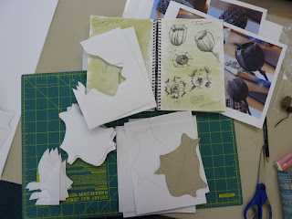
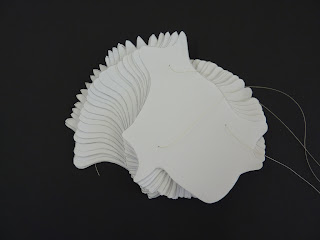
At the time I chose a positive shape that was based loosely on a cross-section of gumnuts (part of diploma theme) - the cardboard shape at the bottom of the photo.  I now realise that this particular shape was a bit too circular and probably lacked sufficient asymmetry but all experience and I made many....many.....

9.27
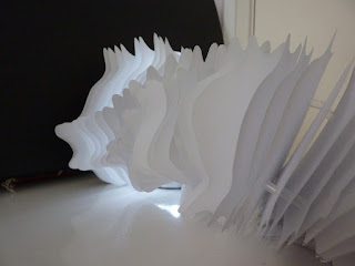
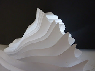
 (did I say many?) copies, joined them together with fishing line and spacer cut straws creating a flexible form. The undulations were quite subtle but I found that lovely shadow effects suggesting movement were formed in my photographs.
9.28
9.29
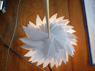
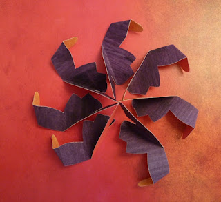
Parts of the negative shape in repetition gave interesting spirals with tonal variation in the light.
9.30
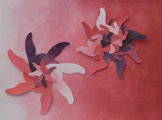
With these experiments in mind, I looked at arranging my slip shapes into spirals -

9.31
This was a bit of a 'wow' moment when I interlocked them all and found layers appearing.  The slip shape on the left is that found in 3.24 and on the right photographed in 3.25 of a previous post here.
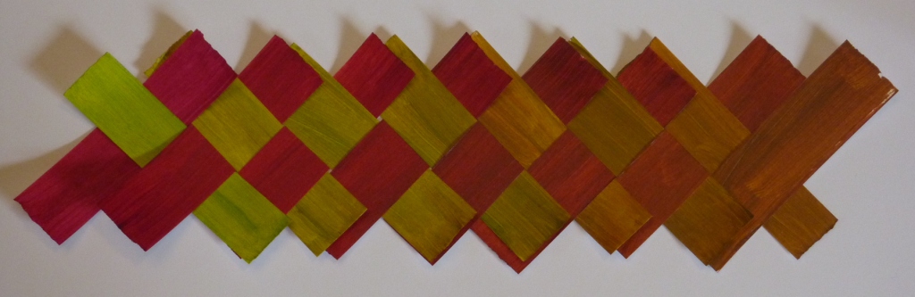
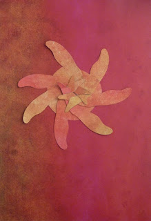
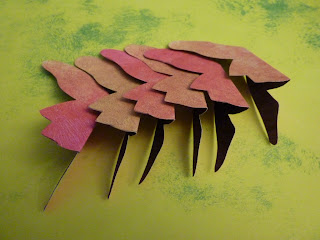
I prepared sheets of card printed with one of my background colour transitions on the front and painted on the back in a dark magenta to allow for 2-sided shapes to be cut out.  I used the same shape as on the left in 3.31 and interlocked them in a similar fashion.
9.32
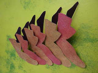
Interesting overall shape but the individual shapes are too similarly coloured to see the detail created.  I cut out a lot more and strung them together at one point with beads in between each shape to give a little separation (9.33 and 9.34)

9.33
9.34
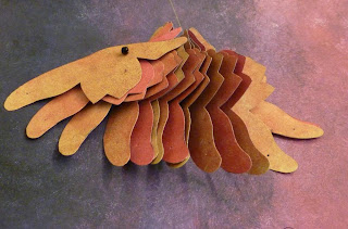
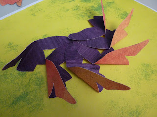
Then strung them at an additional point - look like little birds in flight now, like the profile of this one.
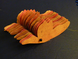
9.35
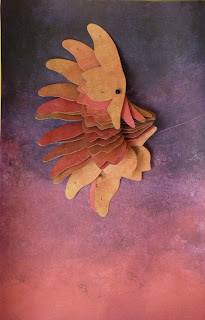
When allowed to fall open like a book of pages, the contrasting side of the shapes can be seen.  But this wasn't really exploiting the 2-sided nature of the shapes.
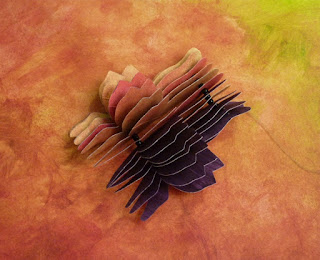
9.36
So I then unstrung the shapes and arranged them utilising folds to display both contrasting sides -

9.37

9.38

9.39

9.40
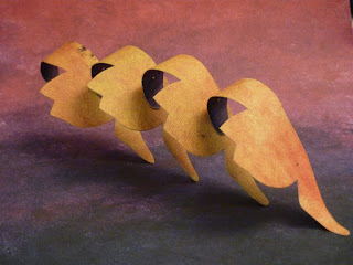
Lastly an arrangement overlapping the slips as a border, cuff, neckline design? - this way or resting on the curves with 'spikes' upwards?
9.41
Now, how to keep that dimension in felt....

Saturday, January 26, 2013

Design work - ch 9

This design chapter begins by examining gradual colour combinations of two colours.

9.1
 I chose the magenta but couldn't decide on the other colour.  I tried a rich green (bottom row in 9.1) but the combinations proved too dark.  A yellow (middle row) gave bright combinations but I went with the lime green (top row) as I liked the browner combinations.

So here are initial swatches of these colour combinations:
9.2
9.3
9.4 weaving of strips
I made A4 sheets of these colours as backgrounds using sponging and general washes and played around with 'patches' of these swatches on these backgrounds.
9.5 reverses the colour transition of the background .
9.5
 9.6 plays with the two end colours on lime green - stark shapes.
9.6
9.7
9.10
 9.11 and 9.12 show the difference between a cooler (predominantly green background) and a warmer background for the same motifs
9.11
9.12
The motifs become a little lost on a busy background of the same colours (9.13)
9.13
One of these colours, magenta selected here, was used to prepare tonal sheets using white and dark grey.  Strips and blocks were cut from these sheets and replaced.

9.14
9.15
And with the addition of an original swatch motif (9.16)- interesting but the hue of the background has changed too much in the photocopying stage I feel to connect with the motif.

9.16
Section B then takes these colour combinations and develops shape into the designing process.  Initially I played with my slip shapes from previous chapters and the tonal sheets of magenta. I got a bit carried away with a photocopier, rearranging shapes and taking photos so I've edited the work with the following selected shots.  9.17 and 9.18 show subtle lines of slip shape with the tonal changes.

9.17
9.18

Then clearer contrasts in tone in the following photos:

9.19
9.20
 A change in slip shape:
9.21
A variation in size of the slips:

9.22
9.23
A background was prepared using the slips as masking stencils to create white shapes, then offset to different extents with various slips as in 9.24 and 9.25
9.24

9.25
I particularly like the graphic 3D block look of the last design.  The rest of the chapter concentrates on 3D designing but will follow in another post.

Sunday, January 20, 2013

Digital image slips - ch 8

This part of the module gave me a choice of looking into shibori techniques or using digital prints in slip design.  I've done quite a bit of shibori dyeing in the past and have tended to avoid using digital prints in my work so thought I'd take the challenge now to persevere with digital printing a little more.  My lack of enthusiasm has arisen from many, many disasters combining fabric and my printer in the past so I did a bit more research, took a few more recommendations to heart and tested things with a lot of trepidation.  To cut a long story short I would definitely recommend the following:
  • carrier paper / sheet for fabric - use a complete A4 label peeled off its backing.  This is so much better than spray glue, glue sticks, freezer paper, and once the fabric is removed the label has sufficient stickiness to be used several times again.
  • if you can, use pigment inks in your inkjet printer.  After wrecking my previous printer with jammed paper, threads etc I bought a pretty cheap Epson printer just for such a purpose.  A papermaker and bookbinding friend recommended that I use Epson's pigment inks instead of 'normal' ones as she found they would could be 'set' with heat into fabric directly, so much easier than pretreating fabric.  I've since found that the digital prints I made using these inks directly onto untreated fabric are just as good as those onto fabric pretreated eg. with Ink Aid or Bubblejet Set, and don't wash off either. Of course this may be different for other printers but I'm glad I've found a method that works for me.
8.1
8.1 The image on the left was printed on silk organza pretreated with Ink Aid: the one on the right on untreated organza.  The left image is brighter I think but the right one is stronger.

To demonstrate the techniques tried and those that I prefer I made a few samples (all about A4 size):

8.2
The background in 8.2 is a posterized digital print of a magnolia leaves transferred from TTP (T-shirt transfer paper) on to pelmet vilene texturised with stuck threads, scrim fragments.  I thought that the texture would show through the transferred print but this was not very successful; I just lost fragments of the print in the roughness.
The slips on the far left are cut from magnolia image directly printed on to cotton fabric, adhered to dyed  hessian fragments. These slips and 2 slips from previous work are attached to the background under couched threads pulled from the hessian.

8.3
8.3: Images of my drawings in a previous post were printed directly onto cotton (coloured image) and cut into strips, and on silk organza (larger b/w drawing).  These have layered onto a monoprinted background with 2 non-digital slips.

8.4
8.4: Again a rather subtle sample using printed organza over printed dyed cotton.
A large image of one of my drawings is printed directly on to dyed cotton, 3 slip shapes cut out then ironed onto white cotton backing.  The top layer of organza was printed directly with several scattered images of my drawings.  The organza also has a larger slip shape cut out (left of middle) echoing the drooping leaf beneath.

8.5
As you can tell I'm particularly interested in digitally printing on organza - love the shadow effects.

8.5 uses the leaf image in 8.2 background printed both on organza (in strips layered over my printed bleach drawings) and printed on to silk chiffon (used to create wired 3D slips).  The curvy shape of the slips is echoed in the rippling cabling stitching attaching the strips.

8.6
Although I had decided to miss the shibori option I took one of the magnolia photo images directly printed on silk organza and tied ceramic baking beans in a Mokume shibori pattern to create a raised form of slip.  The silk organza was steamed for 20-30minutes then allowed to cool and completely dry overnight before the beans were removed.

8.7
8.7 The shibori silk was attached to a posterized image of a magnolia flower printed directly onto cotton lawn.  Free machining echoed the lines of the print and the bubbles of the shibori.


Tuesday, January 15, 2013

Slips with dimension - ch 6

Looked at giving my contemporary slips some 'animation' while still allowing them to be attached to a background. The first method uses wire to give shape to the slip as in stumpwork motifs.

6.1
A wire silhouette of the shape was trapped between 2 layers of synthetic organza and free machined with satin stitch to cover the wire and decorative stitching added in the interior.

6.2
The shapes were carefully cut out (to leave intact negative images) (6.2)

6.3
and the wire manipulated to give dimension (6.3 and added to a previous sample in 6.4)

6.4
I then tried creating dimension in the slip without the use of wire, but exploiting the heat reactive nature of the synthetic organzas themselves.
6.5 shows the slip repeatedly cut by soldering iron from a 6-layered stack of sheers.

6.5
Each stack of slips was reordered and then gently treated with a hot air gun to partially melt and distort the shape.  The background sheers were left unmelted to preserve the distinct negative shapes.  It has a bit of a Monet's waterlilies look about it I think with the white negative shapes like reflections on the water.

The slips in 6.6 below were sewn from a sandwich of dyed silk georgette around a painted piece of Tyvek.
6.6
Once they were cut out, they were gently heated with the hot gun until the tyvek inside began to shrink and distort. The natural silk 'shell' was not affected by the heat so interesting little puffy 'fortune cookies' were formed which could be applied to a background, as in 6.7 and 6.8.
6.7
6.8 detail
The georgette in these samples was quite translucent so the wrinkled tyvek could be seen inside.  I think a rather different effect could be achieved by using a thicker or at least more opaque material, or by initially embroidering on the outer fabric before the sandwich is made - definitely worth sampling further.