Pages

Friday, July 29, 2011

Modifying metal surfaces

The last part of this chapter looked at real metal surfaces eg. copper, brass, aluminium and how to manipulate them by eg. application of heat, embossing, punching, chemical tansformation.

I looked at a number of foils, cans, tubes etc and purchased a few metal shims and meshes to examine.
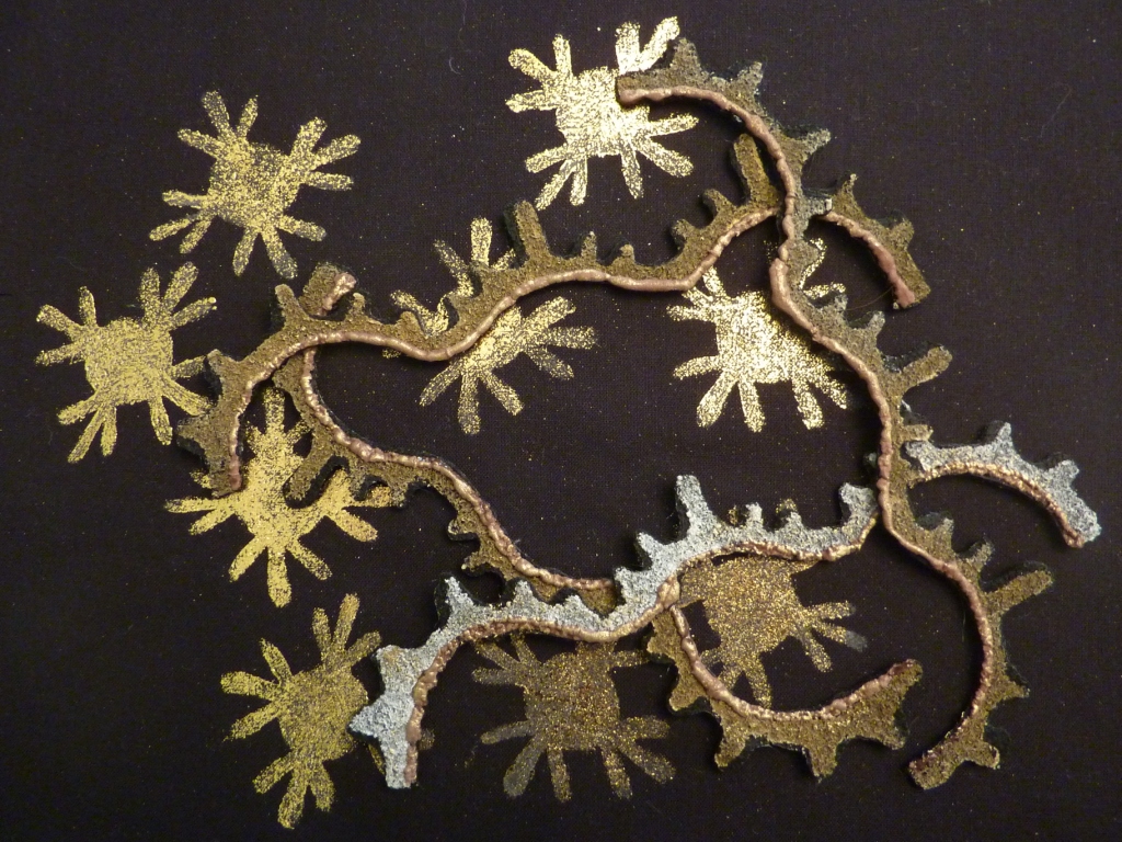
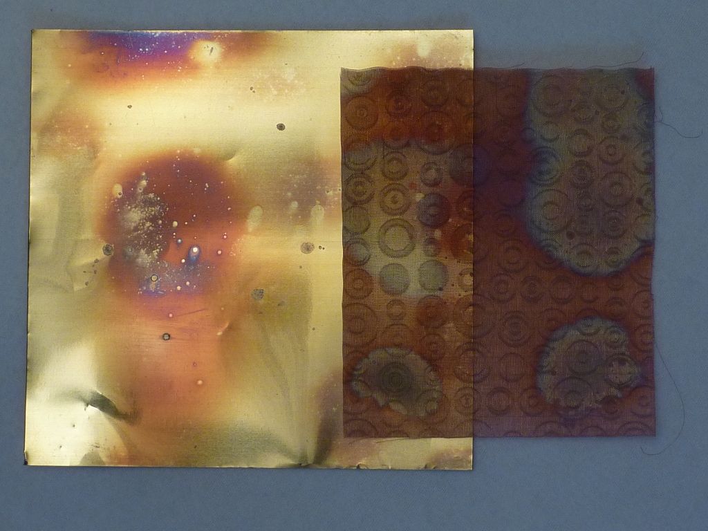
Holding the shims in a gas flame or under a heat gun produced lovely colour patterns.

9.11
I embossed a few using a Cuttlebug intended for scrapbooking purposes but works beautifully here with copper mesh and also in 9.12.

9.12

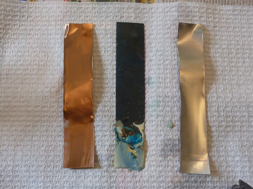
What I was more interested in however was changing the surfaces of these metals chemically so in true experimental fashion (as is my training of course) I set up jars with strips of copper, brass and aluminium/brass shim and added various substances to them to see how the metals reacted over time.

9.13

9.13 shows the 3 strips removed for photographing after 30 mins in a shallow level of vinegar.  You can see where the liquid level has been from the patination on the brass strip.

5 different liquids were used:
  • vinegar
  • Easy off Bam (corrosive floor cleaner)
  • Sigolin (a Brasso like metal cleaner)
  • mixure of ferrous sulphate in vinegar
  • mixture of alum in vinegar
and the strips were photographed after 30mins, 2 days and 1 week in lidded jars at room temp.

I found that the brass strips were most easily discoloured and chemically attacked, very little happened to the surface of the copper (oddly enough) or aluminium. I know that normally copper would certainly be discoloured so not sure what was happening here. Anyway, as far as the brass was concerned,  keeping the strips in the air above the liquid had most effect.  Below the liquid level simply eroded the strips away with time if anything was going to happen.
I won't bore you with all the photos but a few are below.


9.14 Easy off Bam after 2 days


9.15 Sigolin after 2 days
9.16 Easy off Bam after 1 week (aluminium disintegrates)
Clearly to use these in textiles you would not take the patination to this extent but you can get interesting shadings - I particularly like the effects on brass I found.

I plan to examine commercial products eg. liver of sulphur, for discolouring copper and brass a little more as I'd like to control the colours achieved and maybe use sections later in my 2nd assessment piece.

Thursday, July 28, 2011

Chapter 9 (remember that...?)

Now where was I in Module 2?  Oh, yes I hadn't posted up the rest of Chapter 9 on all things metal:
 
9.5 gold oil pastel over rubbing sheet on back cotton

After I had played around on the machine with metallic threads caught up everywhere inside the workings (ah, now it's all coming back why I stopped...) I made some fabric samples using metallic paints, inks, transfer adhesive sheets.
I prepared a number of backgrounds but have only photographed a couple here.


9.6
9.6 shows printed moifs on background in gold acrylic paint with separate printed segments of these motifs added on top.  These shapes were printed on black kunin felt then soldered out.
 
9.7

In 9.7 the background shapes were added from tranfoils using adhesive on my foam stamp.  Similar felt motifs were added.  Expandable puff paint was added to the edges to give further dimension.  You can see this in 9.8 below

9.8
In 9.9 I created a large felt piece in a similar fashion, printing and foiling but this has further embroidery in metallic thread before it was heat gunned and applied to a printed background. 

9.9
9.10

Wednesday, July 27, 2011

Sketchbook - day 12 colouring in

For this, I made a fruity arrangement of a pear, grapes and a couple of lychee.


The background was a piece of dyed homespun cotton.
I used Koh-i-noor paints for the background.


I've now read Sian's next post about highlighting the individual elements and wish I hadn't included these knobbly lychee but never mind.....

Tuesday, July 26, 2011

Sketchbook - day 11 mixing colours

I went back to my pears for this task and looked at the greens and browns in the fruit.
I did a quick collage page using torn pieces of fruit and veg from magazines and then made a coloured page using layers of oil pastels. 


The layers allowed me to scrape out pear skeletons - the top one had a bottom layer of yellow pastel and the lower shape had a bottom layer of black pastel.
I then did two green coloured pages using layers of Koh-i-noor paint adding oil pastels as a resist to get a mottled effect of brown / green like on the pear skin.
I was given a set of these paints last year during Urchfont so kindly by Betty, to try out and I simply love them.  They are so full of pigment.  So thank you, Betty.

In the last pages I used other blends of watercolours to get the greens and matched some fibres and fabric with the pages


Monday, July 25, 2011

Sketchbook - day 8 surface pattern

The challenge here was to take a relatively simple surface pattern and use that to reflect the 3D nature of the object.
Looking at my stripy pyjamas this morning I took a couple of photos of the folds:

The first drawing was done in watercolour pencil -


 Didn't work out too well - the valleys and peaks ended up in reverse I thought...

I used a fine marker pen for the second drawing below to see if varying the thickness of the pattern lines a bit more carefully would give me better results.  Also some smudging done with water for depth and shadows-


I then decided to look at different fabric, a check instead of only stripes -
Again I used fine pen and a little watercolour pencil smudged with damp paintbrush for shadows. 


Sunday, July 24, 2011

Sketchbook- day 7 surface lines

Day 7's challenge concentrated on presenting a 3D drawing using only the surface decoration lines rather than the edge lines.  I decided that my pears did not have sufficient surface decoration and so looked at some tangerines.  The outside skin was dimpled but not really sufficiently lined for this task so I looked at the segments, particularly the lines of pith surrounding them.


I didn't really manage to get a 3D look with just these veins though, so i kind of cheated with shading by wetting the page and the pen lines with water.  The lines didn't really follow the contours of the object so that was probably half of the problem.
I also looked at the inside of the skin and tried to draw that texture with layers of shapes in pen and watercolour pencil.

Friday, July 22, 2011

Sketches day 6 - getting bigger

Miraculously overnight my pear resurrected....and duplicated....

I thought about carrying on with the half eaten one but hey, it looked so juicy, I couldn't resist.   So one visit to the supermarket later I'm back again.


I chose a thick charcoal stick to draw the bottom of the pear with thick marks and the edge for finer lines.
I did find the spiral back a bit annoying and also wished I'd stained more of the pages in the hinge area but good practice.

I repeated the task using an artist's brush marker pen in green to try and get a variation in line thickness.  I used cross hatching to get a bit of shading on the pear but couldn't resist also blending the lines a little with water.

Wednesday, July 20, 2011

Summer Sketchbook project

SinceI missed out on the Distant Stitch school at Urchfont this July I've decided to take part in Sian's sketchbook project and hopefully get myself stimulated to do more C&G diploma work.

I stained some pages of a llittle A6 sketchbook with black tea and also with green tea which gave a more yellowish tinge to the pages.  After Anne commented on using coffee, I sprinkled some coffee grounds onto some of the damp pages which left interested speckles to the background.

I picked a pear as the subject of my sketches.
The next sketches used a pen with watercolour pencils.  The sticker is from the original pear.
The photo below is of sketches with shadow work (day 6 from Sian) using charcoal and watercolour pencil.


I left my sketchbook open on the table ready for the next task together with my 'model' but came back down to find this......

.......I'm not put off but I think I'll need another pear.....grrrrr

Nuno felting workshop

Always eager to learn from tips and techniques from different felters, I attended a weekend workshop recently with SooMee Kim from Melbourne.  It was held at Beautiful Silks, Fitzroy, Melbourne which in itself was a treat to see.  The selection of hand dyed silks and fibres was amazing.  I was the proverbial kid in a sweet shop with as little restraint in my purchases.  Only the size of my suitcase restricted me!

Anyway, the workshop - we all made wraps over the 2 days based on hand dyed merino prefelt which were reversible in their design.
These photos show my 'plainer' side that had less nuno felted silk and more loose roving and fibres than the other side.


I found that this prefelt only shrank by about 10% by the end, even though I continued to felt the piece once I got back to Sydney. This prefelt was made by wet felting and hand dyed too so that probably accounted for the low degree of shrinkage and the difficulty I had in firmly felting in thick fibres and silk despite sandwiching wool roving in between prefelt and fabric.  I tend to use prefelt that has been only needlefelted with more loft not wet felted and so this makes it a little easier.