Pages

Saturday, November 14, 2009

Sculpture by the sea 2009

Last weekend I went to see "Sculpture by the Sea" the annual sculpture exhibition and competition held on the headland between Bondi Beach and Tamarama Beach in Sydney. The wind was fairly strong so we could watch many intrepid surfers tackling the waves at Bondi as we walked along the coastline.
This is Bondi (above) and Tamarama (below)


This exhibit reminded me of your work, Jane.


I did love these fat little bronze men mirrored below the plinths.


This one was made out of cut sections of plastic pipe arranged in a honeycomb pattern. It was in the path of the tide so was gradually being eroded away over the 2 weeks of the exhibition.


Horses seemed to be a popular inspiration this year - this one beautifully woven with amazing detail.

You can see more of the detail below.


This rather buxom beauty was made out of old car parts, particularly the door frames. You can tell the scale from my son beside it.

You couldn't escape the natural sculpture of the rocks themselves, but this last exhibit reminded me so much of summer school and Janet Edmonds' repetitive shapes. These knotted strands were about 5 or 6 feet in length and appeared to be made out of hundreds of discs of resin, about the size of your hand. They matched the stone colourings and hung swaying in the breeze - definitely my favourite for the day.

Friday, September 25, 2009

Red sky in the morning.....

As some of you might have read in your papers, we woke up on Wednesday to this in Sydney. Well, not exactly this view 'cos I live overlooking the bush, but just as orange a sight. I've never seen anything like it, very spooky indeed!

My camera was without battery of course so I couldn't get my own photos but it changed from this red to orange to yellow as the day went on. My son, never slow to spot an opportunity, chose to tell me that some schools were closed for the day but apart from endless red dust still everywhere, it wasn't too bad.
However, I decided to stay indoors for the day (what a great excuse) and get on with some sewing. After comments from Sian I've been playing around with my lacework trying to see how I can create a complete piece of "fabric" out of the shapes to use in my dress, or at least how big a piece is manageable. I got somewhat sidetracked of course and played intially with a scarf length piece of chiffon which evolved into this:


and then this clutch bag where the chiffon was directly sewn onto the black silk then remaining chiffon soldered out. I did some further outlines after to give more interest.


I did another scarf in purple using connecting swirls.

Now to get back to the patterns I should be working on..

Monday, August 31, 2009

More on my wearable

Started thinking a bit more about my idea for a wearable 3D item. I say 'wearable' because although I'm aiming for a dress we'll see how it develops and ends up. I looked at the red/green monoprint pattern and began to try ways of creating the effect while maintaining the lacy feel. This photo shows my planning board which is keeping me focussed.


I simplified the main green motif in a drawing then prepared it in green and red chiffons and organzas in various sizes, sewn on water soluble fabric then cut out by soldering. This will keep the translucency of the layers.


I placed the motifs onto a 'red' background and felt that more 'obvious' lacework was required so chose to sew the meandering green line of the pattern in an open green lace. I've tried a couple of further lace patterns below in pinks/reds create layers.


In this first idea the fabric will consist of two layers - 1 the motifs and lacework will be an entity of its own and 2 the under layer of reddish organza and chiffon. The under layer needs to have a bit more texture / pattern akin to the original monoprint but I don't want to detract from the upper lacework. I've only randomly tucked and pleated the organza then soldered slits in it to change the colour.


I've also looked at creating the pattern on one fabric where I've used painted Lutradur, resist embroidered then heat gunned away the rest. The linking 'vine' is a couched cord made from red organza. I like the lacy effect but it feels 'crusty' as you'd imagine after melting a polyester web so not sure if it's a suitable choice for a 'wearable'. The background dyed cotton has texture from dyed Saa bark but would need to be darker in colour.


The straps could be principally a braid perhaps with threaded motifs echoing those in the dress. The photo is a bit dark but I've tried a 5 stranded braid using machined cords in green and red and that seems to be a suitable width. I've tried the red motifs in different thicknesses with and without interfacing, and tried lacing them differently.


And with so much pattern I thought the bodice area should be fairly plain, perhaps rouched or pleated chiffon.


By the way, the dress is only partly coloured in - it's not as daring as it looks!

Thursday, August 27, 2009

Towards an embroidered item

I prepared an A3 size piece of material (top left corner of Page 12A below) from fabric pieces overlaid with fine netting and free machine and cable stitching. Shapes (derived from the black and white bark lace drawing in chapter 11) were cut out and edged in fushia machine buttonhole stitch. These shapes were arranged in various compositions and temporarily sewn together to give the impressions of 3D items.

Page 12A:

Page 12B:
Another piece of material was prepared in a complementary colour scheme, the shape (UFO-like) taken from a monoprint design in chapter 11.
Various compositions are shown combining the two shapes in this page and the next (page 12C)


Page 12C:


Page 12D:
I took these compositions, scaled up and down, and suggested their use in various clothes and accessories eg. bags, hats, scarves, and earings.


Tuesday, August 25, 2009

Bold marks

Since I had some interesting papers already made I decided to look at those marks in closer detail for this section of design.

Page 11A (above):
The paper was decorated with sweeping broad brush strokes in acrylic paint on an inked background. I cropped two areas which had overlapping strokes and played around ending up with quite leafy looking border patterns and flowerlike motifs.


Page 11B:
I picked a square cropped area from a paper that had been monoprinted in several layers. The repeated shape gave endless designs but I've highlighted 3 above that again had a leafy theme of creepers and vines, etc. Since the original monoprint was made with pigmented gel medium, the reddish background (if you enlarge it) has a lot of interesting texture in it which I like.

Page 11C:
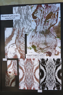
I also went back to some monoprints of Saa (mulberry) bark, cropped parts and played around in positive and negative designs. The laciness (if that's a word) really appealed to me and so I looked at that further.


Page 11D:
I looked at simplifying the cropped bark monoprint before replicating in a line drawing here.
I've then overlaid that image onto design 11.7 on page 11B using cellophane.

Friday, August 21, 2009

Design with Image copies

It might seem like I'm working 24 hours/day at the moment but really only now piecing together the story around designs I created before summer school. I thought it helped to keep the heap 'flexible' but actually my brain just copied the heap and got more confused. Hopefully this will give me direction now.


Page 10A:
I took my photo of coloured leaves, cropped two similar but different images from it, grayscaled and colourwashed them in theme colours. These were enhanced with crayon and bleach marks then cut up into sections resembling branches. Each enhanced page was A5 in size as in bottom right of page.


Page 10B:
These pieces were arranged in interesting designs (10.1 to 10.6). The designs were about A4 in size but were reduced for the A3 page.


Page 10C:
The designs from 10B were further enhanced with pen, crayon and paint marks to link the pieces. The marks resembled leaf shapes. The designs can be seen in more detail by clicking on the page to enlarge it.


Page 10D:
I looked at design 10.10 on the previous page further. I printed the scanned decorated paper image on to vellum to exploit the translucency, creating more layers, and enable the positive and negative leaf shapes to appear from underneath. In retrospect the original decoration of the image is a bit lost on the dark green background, perhaps confused further by the additional cable stitching in the background.
The leaf shapes are created on top with cable stitch and the fushia pink marks replacing the original leaf stamp have been half stitched / half woven.


Page 10E:
I played further with design 10.10 by cropping two smaller interesting sections from it which had clearer shapes, making repeated copies flipped and unflipped. The result is, or course, 70s wallpaper but I like the band / border designs created in 10.14 and 10.15, and the motifs in 10.16, particularly the one created by the lacy white leaf shapes, I think are worth taking further.

Tuesday, August 18, 2009

Chapter 9 - Design with abstracted fragments

Planned to post up this work before mounting on formal pages but realised that too many photos would have been required and the post way too lengthy. So here are the summary pages from the work which enlarge a little if you click on them.


Page 9A (above):
I picked a line drawing (9.1) from my sketchbook of saprophytes to develop, abstract and manipulate in Photoshop.


Page 9B:
Looked at design 9.9 from the previous page in various colour combinations of my colour scheme.

Page 9C:
Went back and did the exercise again with another design of flowing lines taken from my favourite wiggly tree. The photo below shows the original design idea in more detail.


Page 9D:
Selected two twisted manipulations (9.18 and 9.19 on page 9D) and looked at colour combinations again. I felt these looked more promising and related back to flowing branches, vines, etc more easily.


Page 9E:
Took design 9.19 and explored the colour fragments further on a larger scale using my decorated papers. Tried to combine some fragments in similar papers within a complementary coloured background - but feel that there is too much pattern here to produce clear designs.

Page 9F:
Presented the most interesting shapes from combined fragments on at the top of the page. Realised that the interest probably lies not in the shape itself but in the movement portrayed by the fragments.
The rest of the page looks at extrapolated designs from this with some texture and relief to give movement in the design. Must try not to keep on returning to coils and spheres, though!

Saturday, August 15, 2009

Chapter 7 - colour and stitch

I prepared some decorated papers in my colour palette (A2 and A3 size) for use in the various design exercises. The photo below shows a small area of some of these.

I used stamping with acrylics, pigmented gels and gloss varinishes, rubbings, monoprinting, bleaching and ink washes. Some had an obvious plant theme and others incorporated the shapes, textures from my sketchbook work.
I took a few and worked at translating them into stitch as follows:


7.1 I tried to interprete the broad strokes with fragments of overlapping dyed scrim and free motion straight stitch.


7.2 The paper had quite a texture to it through the use of molding paste so I used dyed Saa bark with scrim fragments to give a rough texture overlaid with machine embroidery. The shadows in the background come from pieces of cloth and wool tops embellished through from the back.


7.3 The cheesecloth background is embellished with wool tops and scrim from behind, has green netting, overlocked thread strips and pieces of pink Saa bark worked in with whipstitch in different threads.

This paper was prepared from rubbing oil pastels over a plastic grid in various directions, then inked over with terracotta and green Procion dyes.

7.4 The stitching has embellished green and beige wool tops in background flesh muslin. Dyed hessian pulled apart has been attached using whipstitch and then further whipstitching and cabling in pink (green in bobbin) make the checkerboard effect on top.

Tuesday, August 4, 2009

Summer school - so long ago

Well, I've finally made it back to Sydney after a great trip around the UK. I'll blog later on some of the exhibitions we visited.
The summer school seems so long ago but I thought I'd share some of my photos of our work with you all. It was lovely to see students again after 4 years and to meet new students now on the course.
We spent 2 days or so tutored by Janet Edmonds looking at repetitive shapes and the 3D objects created from them with a view to translating them into fabric forms.


My shape (here in cardboard) was inspired by a pen and ink drawing of gumnuts in my sketchbook. Repeated copies of this shape cut from cartridge paper were strung together to create a snake-like 3D form that created interesting shadows in a light box.

I didn't get to translate this into fabric in the time at Urchfont but I'm working on the same principles to reflect some lacy structures in vegetation designs that I've been creating in Module 1 (more later, hopefully).

This photo briefly shows the diversity of paper structures created in the workshop.
The rest of the school, about a day or so, was tutored by Sian looking at 3D structures based on lacy 'fabric' created from watersoluble fabric.

This piece of 'material' was dampened over a polystyrene ball, rinsing away sufficient stabiliser to reveal the lacy appearance but retaining sufficient to give structure to the form once dried.

This bowl is actually the second moulded form of the above 'material' since I found of course that I couldn't get it into my suitcase to bring home! I had to rewet and squash flat back into its sheet form and dry that way to ,then wet and reform in Aus - a little less solid but firm enough!
This photo shows everyone's structures in situ before they are are completely dry, along with their inspiring artwork from which the colour scheme and patterns were drawn.
How did your mask turn out, Jane?